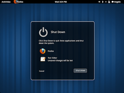
I won't say anything regarding the usability, but GNOME Shell does seem to be heading to the right direction - from the design point of view (the mockups we've seen so far are using the default theme - remember how the default GNOME 2.x theme looks?) -, especially now when many applications (and even Linux distributions - Ubuntu) focus on a better default design (and usability) as opposed to how things used to work: lots of customization options but ugly / almost non-usable default look in some cases.
After we've seen some GNOME Shell Login / Lock screen mockups, here are some logout, shutdown and restart mockups to go with it (which have been posted to the live.gnome.org today):
And here's the user menu too:
- Gnome Shell Might Add Real Multiple Desktops
- Possible New GNOME 3 System Status Area Changes [Mockups]
Mockups via live.gnome.org/GnomeShell


Tidak ada komentar:
Posting Komentar