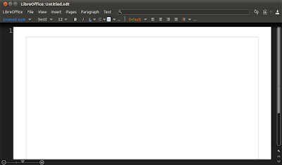
Speaking of LibreOffice, WebUpd8 reader Nathan Moos mentioned some refreshing mockups called Citrus UI (please note that these are not official mockups!).
Citrus tries to remain somewhat familiar while brining more logic by reorganizing things differently - such as the File menu which currently holds commands that are in no way related to the current file. Further more, the menus are contextual meaning you won't get any grayed-out menus and instead, they are hidden by default.
But you won't really understand until you see some actual mockups so here goes:
(LibreOffice Home)
Citrus tries to cover every little detail: from minor interface elements to the to how and when everything should be implemented, proposing even a gradual implementation so that it doesn't cause "any power user to get frustrated and leave".
But Citrus is not just about the mockups in this post! There's a whole website with many mockups and ideas which explain how things should work. Check it out at http://clickortap.wordpress.com/
What do you think? Does Citrus make more sense or is the Blender-ish sidebar we've just posted more user-friendly?
Thanks to Nathan Moos for the tip! Mockups via Clickortap.


nice
BalasHapusthat's very awesome for me