Powered By

Powered by Blogger

Tampilkan postingan dengan label mockups. Tampilkan semua postingan

Jumat, 25 Maret 2011

[Poll] Do You Want Customizable Categories In Synapse?

Synapse

Do you like Synapse and want to help? Alberto, one of the Synapse developers wants to make the Synapse categories customizable but before proceeding, he wants to hear your opinion about it so head over to Alberto's blog and check out his mockup, then vote! You can also leave a comment telling him if you like it or what he can do to improve it.

I want customizable Categories, do you?

Selasa, 22 Maret 2011

Unity Video Mockup: Better Menus, Social Networking Widget Layer

Frederico Araújo Mendes has created a very interesting Unity mockup (video) in which he proposes better menus and a social networking widget layer.

In Frederico's Unity, you have a regular dock with some fixed icons and an area for items you open / pin. Clicking the Ubuntu logo in the top left corner will flip the "dock" (just like it was in the "2 sided dock" mockups) and here you'll have basically all the regular menu categories, but displayed on the dock.

This is a very interesting idea which I like because it feels a lot more consistent then how Unity looks right now. And the social networking widget layer is something I'd absolutely like to see in Unity.

This is not just another 2 sided dock mockup! Check out the video below:


What do you think?


Thanks to Frederico for the tip!

Minggu, 13 Maret 2011

Mockups: Add / Remove Workspaces In Unity

Ubuntu 11.04 lacks a way to manage multiple workspaces. Sure, there is a workspace switcher, but no easy way to add or delete workspaces and doing this from CCSM is not easy to find and it can't be used to add/remove workspaces on the fly.

A while back, there was a very interesting mockup that was rejected for Unity but something similar was then added in Gnome Shell. But maybe something simpler has a better chance.

WebUpd8 reader Georgi came up with a very simple way of adding or removing workspaces which you can see below (this is just a mockup!):

Multiple workspaces mockup Unity


Update Here's another Firefox 4 "Panorama" like workspace manager mockup created by BigRZA @ DeviantArt (thanks to arzali for the tip!):

Panorama workspace manager mockup


Workspaces are a powerful tool and Gnome Shell acknowledged this from the beginning (even if you don't like Gnome Shell, I'm sure most will agree that the way it handles multiple workspace is very intuitive and easy to use). Maybe it's time for Unity to do the same?

What do you think?


Related: How To Add / Delete Workspaces In Compiz Using Keyboard Shortcuts


Thanks to Georgi for the tip!

Jumat, 11 Maret 2011

More Unity "2 Sided Dock" Mockups [Ubuntu 11.04]

Unity
(This is just for presentation - see the mockup links below)

David Reichling posted some new mockups for the Unity dock in a comment on our initial Unity "2 sided dock" post but since not everybody reads the comments, here are the new mockups:

1 Dock:
2 Docks:
The mockups are pretty self-explainatory so check out the links above (and don't forget to click the Ubuntu logo in the top left corner!) to see Marc's new ideas.

Rabu, 09 Maret 2011

Unity "Two-Sided Dock" Mockup

There's a long thread on the Ayatana mailing list about the upper-left Ubuntu button in the upcoming Ubuntu 11.04. Currently, this button will open Dash. But there are also two shortcuts in the launcher which trigger Dash (Applications / Files Places) which make the Ubuntu button redundant - this lead to some new ideas for the upper-left Ubuntu button behavior.


Unity two sided dock mockup

One very interesting idea was posted by Marc Lajoie and he calls it "two-sided dock". Here's how it's supposed to work in Marc Lajoie own words:

On one side, the application buttons, on the other, the "function" buttons. The Ubuntu button would flip the dock over (perhaps with a pretty revolving animation!).

Of course, if the dock is hidden, the first click will recall it. The second click will flip the dock.

He also adds:

The dock could be recalled immediately when hovering over the button, saving the extra click when using a mouse, so that to get to the "places" side of the dock only one click would be necessary.


To understand exactly how it's supposed to work, check out this functional web mockup.


Mark Shuttleworth seems to like the idea so we might see this in Unity sometime. But for now it's just a mockup!


What's your opinion?

Image credits: Marc Lajoie

Kamis, 17 Februari 2011

Unity Mockup: Menu Integrated In The Window Titlebar

One of the design goals of Unity is to reduce the clutter of the desktop, another is to use space more efficiently.

We hide the menu by default in Unity because the menu provides no useful information to which you can refer just by looking at it, but it puts a lot of detail on the screen which is visual clutter. So, we’ve taken the view that the menu is there if you need it (by moving the mouse to it or pressing Alt) but otherwise isn’t in your view.

Many modern applications are doing without a menu altogether, so in our view, this is a step towards the future, and it will encourage application developers to think about their interfaces and make them more usable by design rather than depending on the crutch of a menu.

The text above is a quote from Mark Shuttleworth is which he talks about the reasons behind the decision to put the menu on the top panel and set it to autohide.


The idea


Based on this, Ubuntu user Andrea Azzarone came up with an idea/mockup to integrate (with autohide) the menu bar in the title bar for ummaximized windows:

Unity global menu in titlebar mockup


Something like this (but without autohide) is already possible in KDE:

KDE menu titlebar


In my opinion, the idea is great for two reasons:

1) Having the menu on the top panel, the mouse needs to travel a lot to get to the menu (this is a pretty big issue for some and it was brought up for discussion multiple times on the Ayatana mailing list). And since Unity will be default for the Desktop edition too, that means you can have a very large monitor so that distance can be huge. Having the menu in the titlebar would solve this issue.

2) The titlebar is pretty useless anyway and takes up a lot of screen real-estate for just the window controls and window title. And the window title will still be displayed since the menu uses autohide. Yes, they said they will implement Windicators in the window titlebar, but I'm starting to think that was just a diversion to silence the users about the decision to move the buttons on the left without any reason whatsoever (ok, I'm kidding here... partially).


But I guess there might be some other downsides I've overlooked (except for the most obvious one, also mentioned by Andrea - see below).


Possible issues


While the idea makes sense (if only based on what Mark Shuttleworth said), there are some potential issues that may arise using this: most importantly, how do you drag the window? Use the left button mouse for the menu and right mouse button for dragging? Add a new window control that allows you to move the window? Drag a window by clicking (and holding the mouse button down obviously) anywhere on the controls or other UI elements (except for the content area). I guess there are a lot of solutions for this, but one very simple yet functional "fix" must be chosen if this was to be implemented.


It will be interesting to see how this idea will be perceived on the Ayatana mailing list (where it was currently posted). But how about you? What do you think?


More info / screenshots credits: Ayatana mailing list | Ubuntusecrets.it (in Italian) | Deviantart

Selasa, 18 Januari 2011

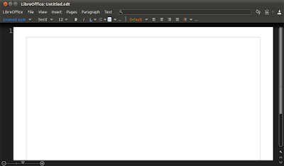
More LibreOffice Mockups: Citrus UI

Speaking of LibreOffice, WebUpd8 reader Nathan Moos mentioned some refreshing mockups called Citrus UI (please note that these are not official mockups!).

Citrus tries to remain somewhat familiar while brining more logic by reorganizing things differently - such as the File menu which currently holds commands that are in no way related to the current file. Further more, the menus are contextual meaning you won't get any grayed-out menus and instead, they are hidden by default.

But you won't really understand until you see some actual mockups so here goes:

Libreoffice Citrus mockups

LibreOffice citrus mockups

LibreOffice Citrus mockups

Libreoffice citrus mockups

LibreOffice
(LibreOffice Home)


Citrus tries to cover every little detail: from minor interface elements to the to how and when everything should be implemented, proposing even a gradual implementation so that it doesn't cause "any power user to get frustrated and leave".


But Citrus is not just about the mockups in this post! There's a whole website with many mockups and ideas which explain how things should work. Check it out at http://clickortap.wordpress.com/


What do you think? Does Citrus make more sense or is the Blender-ish sidebar we've just posted more user-friendly?


Thanks to Nathan Moos for the tip! Mockups via Clickortap.

Senin, 17 Januari 2011

LibreOffice User Interface Mockups (With Sidebar)

Paulo José posted some very interesting LibreOffice UI mockups at DeviantArt for which he says the main inspiration was the Blender UI:

LibreOffice UI mockup


LibreOffice UI Mockups


Please note that these mockups are not official! More mockups @ http://pauloup.deviantart.com/gallery/28216273


Update January 18th: After seing Paulo's mockup, Nathaniel (thanks!) wondered how it would look with the default Ubuntu Ambiance theme/Humanity icons instead of a custom theme and here is the result:


Libreoffice sidebar mockup
(Image original link: Flickr)


What do you think?


See also: More LibreOffice Mockups: Citrus UI

Thanks to Paulo José for the tip!

Kamis, 23 Desember 2010

Unified Me Menu And Messaging Menu Mockups; Ubuntu May Get A "Silent" Mode

There is a discussion going on @ Ayatana mailing list regarding the merge of Me Menu (the applet that displays your name, used to set your status) and Messaging Menu (Chat, Email, etc.) and mockups have already started to be posted:


1. Unified Me Menu and Messaging Menu indicator by mockups by Saleel Velankar:

Unified Me Menu Messaging Menu mockups


me menu messaging menu mockups


2. Unified Me Menu and Messaging Menu indicator by mockup by Frederik Nnaji:

unified me menu messaging menu mockup


In both mockups, besides the unified Me Menu and Messaging Menu you can also notice a "Do not disturb" mode which has also generated a lot of discussion on the Ayatana mailing list: the plan is to include this mode sometime around Ubuntu 11.10 and it won't only set your IM status, but set your whole computer in a "Do not disturb" (aka "silent") mode:


When busy, occupied or in a "Do Not Disturb" state of mind or activity, we need a way of silencing incoming calls and other in that moment trivial notifications: Silent Mode.

Silent Mode
* mute notification sounds
* mute NotifyOSD bubbles
* mute ringtone for incoming calls
* don't popup update-manager automatically

What is the current implementation of this on the desktop?
Mute all notification sounds:
* "mute all" via Sound Menu
Mute NotifyOSD bubbles:
* uninstall NotifyOSD manually
* disable bubble notifications in Empathy
* disable Empathy
* use a different DE
Mute ringtones:
* go offline
* disable Empathy/Skype
* "mute all" via Sound Menu

Mark Shuttleworth:

[Has anyone started speccing this out already?]

I don't believe so. If you would like to do a spec, either work with MPT or I'll review it with you until it gets approval and then it can be queued for 11.10. This is LOOOONG overdue, and I appreciate your offer of help.


What do you think about the mockups? How about the "silent" mode?

Selasa, 07 Desember 2010

Unity Applications View Mockups

WebUpd8 reader Jorge Guerrero sent us an email with a link to a PDF (which was posted by Vincent Moulin @ Ayatana mailing list) that has some very interesting Unity applications view mockups:

Unity applications view mockups

Unity applications view mockups

Unity applications view mockups


In case you don't know, the applications view is triggered when clicking the Ubuntu logo in the top left corner and it currently (in Ubuntu 10.10; it hasn't been implemented yet in the new Unity in Ubuntu 11.04) looks like this:

Unity applications view


These are not official mockups so they may or may not be implemented in Unity, but one thing is sure: the old Unity applications view definitely needs some work!


What do you think?


Download the PDF (includes the screenshots in this post as well as some extra info).


Thanks to Jorge Guerrero for the link to the PDF. Credits for the mockups: Vincent Moulin

Selasa, 23 November 2010

Gnome Shell Automatic Workspaces Mockup (Tiled View Follow-Up)

This is getting more interesting every day!

A while back we've told you about an interesting Unity mockup for managing multiple workspaces that automatically creates the workspaces and always keeps an empty workspace so you don't have to create the workspaces yourself (and you always have the number of workspaces that you actually need).

Unfortunately, Mark Shuttleworth didn't like the idea (at least the way it was described back then) so it seems like we won't have this in Unity. But on the other hand, it looks like we'll have it in Gnome Shell (not exactly the same, but the same concept is being used). Read on!


Gnome Shell tiled view mockup


If you remember the Tiled View Gnome Shell mockup we've talked about yesterday, Jakub Steiner said "[... ] we still rely on the user to do workspace "management. So the next step is to make the Shell do the heavy lifting. Stay tuned." Well, today he posted another mockup that behaves a lot like the Unity workspaces mockup I've told you about in the beginning of the post:
  • There are no empty workspaces (apart from the initial state of not having any windows open whatsoever). If there are no longer any windows on a particular workspace, it gets merged with the adjacent one. This is a bit different then Unity because in Gnome Shell, you'll never have an empty workspace (as opposed to the Unity mockup where you always have one empty workspace), but the base idea is the same: always have the number of workspaces you'll need, without having to create them yourself.
  • To launch an application in a new workspace, you drop the launcher on the [X] target thumbnail. Similarly you can launch it onto existing workspace or move windows to a new/existing workspaces.


Also related to Gnome Shell: I've yet again updated the post on how to compile Gnome Shell in Ubuntu 10.10 so check it out if you want to try it yourself (but you won't get the automatic workspaces feature since this is a mockup for now).


Your thoughts?

Senin, 22 November 2010

Tiled View: New Gnome Shell Mockup

A new Gnome Shell mockup shows how the old Gnome Shell behavior (which is actually still the current Gnome Shell behavior) and the new Overview-Layout Gnome Shell branch can work together, bringing both innovation and usability (called "Tiled view"):


(If your video does not support HTML5, you can watch the video @ YouTube - but it's lower quality)


The workspace sidebar is hidden by default, and slides out when the cursor is near the edge of the screen or when a drag is initiated on a window or launcher.


But that's not all! Jakub Steiner explains on his blog:

Now while I think the workspace thumbnailing addresses the most useful part of the tiled view, we still rely on the user to do workspace "management". So the next step is to make the Shell do the heavy lifting. Stay tuned.


What do you think?


Kamis, 28 Oktober 2010

Interesting Unity Concept For Managing Multiple Desktops [Mockups]

Now that Unity will be used by default in Ubuntu 11.04 Natty Narwhal, it's been getting a lot of attention and there are discussions going on about if and how the Global Menu (AppMenu) will behave on the desktop, a better way of managing multiple desktops and many other subjects. One such discussion drew my attention and I though I'd share it with you.

Some mockups designed by David Prieto show off a really interesting concept for managing multiple desktops - take a look:

Unity workspaces mockupUnity multiple workspaces mockup


The purple spaces represent workspaces and what's so interesting about this is the features that could be integrated into such a simple idea:
  • You can move an application between workspaces by simply dragging its icon in the Unity launcher from one workspace (purple area) to another. In the same way, the workspaces can be reorderd too.
  • The empty space above a purple area (workspace) is for switching to that workspace - click the empty space to switch to that workspace.
  • To open an application on a certain workspace, all you have to do is drag its icon from Dash to the workspace you want it to open to.
  • By pinning an application to the launcher in a certain workspace, that application will always open on that workspace.

More info on how this should work, HERE.


These are unofficial mockups, currently being discussed @ Ayatana mailing list and in a thread on the Ubuntuforums. The idea needs further improvements as there are still some unresolved issues, but what these mockups demonstrate (as a general idea) is that Unity has potential to become something truly great, especially since a lot of the performance issues should be solved by using Compiz instead of Mutter.

And that matters even if you don't plan on using Unity for "now" (and by "now", I mean Ubuntu 11.04). Gnome Shell will be out pretty soon and even though the old panel-syle Gnome will still be available, it won't be around forever so at some point you'll have to choose (if you want to stick to Gnome) between Gnome Shell and Unity.


Oh, and there's one more thing: wouldn't it be cool to have the features in David's mockups on say... Avant Window Navigator, Docky, Cairo Dock or DockBarX (because the Gnome panels aren't dead just yet)? Now that would be something!


What do you think?


Image credits: David Prieto

Selasa, 14 September 2010

Computer Detecting User Presence Video Mockup [Ubuntu]

Here is a very interesting concept: what if your computer could detect your presence and:
  • a window playing a video would automatically go fullscreen when you move further from the screen
  • the notifications are displayed fullscreen when the user is not in front of the monitor so they can be read from a different location
And these are just a few ideas but this can go even further.


This concept is described by Christian Giordano @ Canonical Design blog. Christian also posted a video mockup of this concept, in which he uses "computer-vision", a face recognition library:


Parallax and fullscreen interaction via webcam from Canonical Design on Vimeo.


Despite it could be hard to detect the horizontal position of the user’s head without a camera, we are in no way defining the technology required. The proximity could be in-facts detected with infra-red or ultra-sound sensors. - Christian Giordano


What do you think? Would you find this useful?

Kamis, 29 Juli 2010

New GNOME Shell Mockups Look Like Unity, Nautilus Elementary


Since GNOME 3.0 has been delayed until March, 2011, it seems there's enough time to rethink the way GNOME Shell looks, especially since a lot of people don't like it (especially from the usability point of view).

Some new GNOME Shell mockups were uploaded to GIT recently, showing a lot of similarities with Ubuntu / UNE:


Gedit / Nautilus:

Gedit and Nautilus - GNOME Shell


A closer look at Nautilus:

Nautilus GNOME Shell Mockup

As you can see, Nautilus looks a lot like Nautilus Elementary. We already talked about this, but this is the first mockup of the new default Nautilus which Elementary bits and pieces.


Then there's a new GNOME Shell look which looks incredibly close to Ubuntu's Unity:

GNOME Shell

GNOME Shell workspace


Even the Search seems to be inspired by Unity's Dash:

Gnome SHELL search mockup


I don't know about you, but for me a GNOME Shell like in these mockups is definitely more usable than how Shell is right now. If we can get a usable working GNOME 3.0, it doesn't really matter who inspired who!


What do you think?


In case you don't know how Nautilus Elementary / Unity look like, I suggest you see these:

Senin, 21 Juni 2010

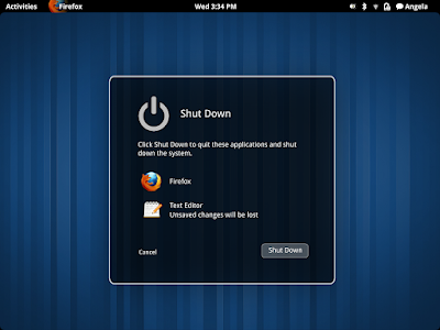
GNOME Shell Log Out And Shut Down Mockups

I won't say anything regarding the usability, but GNOME Shell does seem to be heading to the right direction - from the design point of view (the mockups we've seen so far are using the default theme - remember how the default GNOME 2.x theme looks?) -, especially now when many applications (and even Linux distributions - Ubuntu) focus on a better default design (and usability) as opposed to how things used to work: lots of customization options but ugly / almost non-usable default look in some cases.


After we've seen some GNOME Shell Login / Lock screen mockups, here are some logout, shutdown and restart mockups to go with it (which have been posted to the live.gnome.org today):


gnome shell log out

gnome shell restart

gnome shell shutdown

gnome shell restart mockup


And here's the user menu too:

gnome shell user menu


See also (Gnome Shell mockups):


Senin, 07 Juni 2010

New Nautilus + Zeitgeist Concepts

Well this is fast. Just today we posted about Nautilus (upstream too, not just Elementary) getting Zeitgeist integration and a prototype (already functional) of the "Open file dialog" and "Search dialog" was already created by Seif Lotfy:

nautilus zeitgeist


nautilus zeitgeist


For now there's no way to install this prototype, but if the feedback is positive, the code might be released with the next Zeitgeist version. This might not be the way Zeitgeist will be implemented into Nautilus, but who knows, we might see it in Nautilus Elementary (fingers crossed!).


So what do you think? Don't forget to also give feedback to Seif Lotfy.

Senin, 24 Mei 2010

Gnome Shell Login Screen And Lock Screen Mockups

With the release of GDM 2 (2.22+), we lost the ability to theme (well, it's still possible but only to a small extent) the GDM login screen but with the arrival of Gnome Shell it should be very easy to theme everything Gnome Shell can be "skinned" with some basic CSS knowledge.

Browsing the Gnome Shell wiki @ live.gnome.org, I stumbled upon some great login screen and lock screen mockups which you can view below:


Login screen - select user:

gnome shell login screen screenshot


Login screen - sign in:

gnome shell login screen screenshot


And here is also a Lock Screen mockup:

gnome shell lock screen mockup screenshot


Please note: these are only mockups so far.


What do you think about these login / lock screen mockups?

[credits for the mockups: William Jon McCann @ live.gnome.org]

Rabu, 19 Mei 2010

New Windicators (Window Indicators) Mockups [Ubuntu 10.10]

As you probably know, Ubuntu 10.10 Maverick Meerkat will be getting "windicators" or window indicators. The initial mockups were only sketches but here are some new mockups designed by Dani Planas Armangue:

windicators mockup rhythmbox


windicators mockup ubuntu software center

windicator mockups ubuntu gedit


And for Ubuntu Netbook Edition:


-Normal window:

windicators une


-Maximized window:

windicators ubuntu netbook edition maximized screenshot


Note: these are not official mockups, but they are still pretty close to what window indicators want to be. You can read Mark Shuttleworth's comments on these windicators mockups, HERE.


[Image credits: Dani Planas Armangue]

Sabtu, 03 April 2010

Possible New GNOME 3 System Status Area Changes [Mockups]

Gnome 2.30 was released a few days ago which means the next version will be (or should be) Gnome 3 (which will come with Gnome Shell). I recently came across some System Status Area mockups which might become reality.


The System Status Area is not an area that is variously called the Notification Area or System Tray and should not be used by applications (foreground or background) to indicate their status.


Gnome 3 might start using monochrome colors in the System Status Area - Ubuntu style (or we could call it Mac OSX style):

gnome 3 status icons


The Gnome 3 designers have taken into consideration the order of these icons which is important in terms of usability. This is the proposed order:


  • transient or optional indicators
  • Universal access
  • Input language
  • Audio volume
  • Bluetooth
  • Network
  • Battery and power

All these indicators will receive a facelift to fit the new Gnome 3 look.


The Universal Access indicator should look something like this:

universal access gnome 3

The UI colors in Gnome 3 have been chosen in a way that allows the user to focus every moment on what he's doing.


The Input Language should display a description next to the language abbreviation:

gnome 3 language menu


The Audio Volume will not suffer many changes:

sound indicator gnome 3


The Bluetooth menu should provide much more information which was previously unavailable:

bluetooth menu gnome 3


The Network menu apparently will only have a new look because as you can see, all the info provided in the following mockup is already available in Gnome 2.30:

network manager gnome 3


The Battery and Power menu will be completely redesigned to eliminate the information Tooltips and display that info in the indicator instead:

power menu gnome 3


Another debate going on is rather the minimize button should be removed from the Gnome Shell or now. The minimize button doesn't do what's it's supposed to anymore - as now it just moves the window to the Activities pane and the only way to restore the window is clicking the Activities button. The close button would remain on the right, but there is a suggestion that suggests implementing a new button on the left which could be used for moving the window o a different workspace. The button could either have some arrows pointing to the left / right and witching the window to the previous or next desktop or it could trigger a menu like this:

[1] [2]
[*] [4]
[C] [+]

where:
# - # of workspace
* - current workspace (most probably greyed out)
C - Closet workspace (if that idea is used)
+ - create a new workspace and send the window there.

Not all ideas are about removing the minimize button. Some suggestions also include introducing a new concept for the window minimize event - like making the minimized windows turn into an icon at the current notify bar. Or even simply placing the minimize on the left and the close button on the right which seems to make more sense because the Activities button is placed on the left.

You can read more about this @ Gnome Shell mailing list.


See also: Gnome-Shell 2.29.0 screenshots.